Data Visualization
Challenge
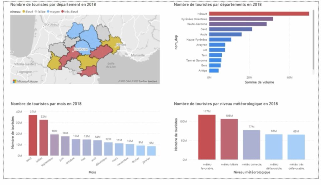
Explore real tourism data from the Occitanie region and tell a compelling story through charts and visuals.
What is Data Visualization?
Before diving in, watch this short introduction to understand the goals of this challenge.
What is this challenge?
As part of this data analysis module, your team will explore a dataset and tell a story using charts — just as you would in a real professional data visualization competition. The goal is not to perform complex statistical calculations, but to communicate clearly and make data understandable to any audience.
The dataset describes tourism activity across the Occitanie region: overnight stays, visitor origins, accommodation capacities, cultural events, and weather conditions. It was originally assembled for the Hackaviz 2020 competition organized by the Toulouse DataViz association.
Rules of the game
.geojson file and a mapping tool (QGIS, Python, Tableau).
The Data Files
The dataset consists of three main data files (available in both CSV and Excel formats) and four reference files that help decode codes and add contextual information. Below is a detailed description of each file, with visualization ideas from beginner to advanced.
What this file contains
This is the simplest and most recommended file to start with. It gives the total number of overnight stays for each day, broken down by Occitanie department. Think of it as a calendar showing how busy each area was, day by day.
Overnight stay volumes were estimated from mobile phone data provided by a telephone operator and the Regional Tourism Committee (CRT). They are statistical estimates, not exact counts.
Columns
Visualization ideas — from simple to advanced
total_occitanie. Instantly reveals the tourism season. Bar charttotal_occitanie as a time series to see the rhythm of the full year. Line chartWhat this file contains
This is the most detailed file in the dataset. Each row represents a unique combination of date + origin + destination, giving you the volume of overnight stays for tourists from a specific French department or foreign country, visiting a specific Occitanie department, on a specific day.
It also includes contextual variables: school holidays in the origin region, temperature and weather quality at the destination, and the number of major events active that day.
Columns
org column uses French department numbers (e.g., 31 = Haute-Garonne) and ISO country codes for foreign visitors (BE = Belgium, DE = Germany…). Use the Départements and Pays reference files to decode them.meteo score: 0 = very unfavorable · 1 = unfavorable · 2 = correct · 3 = favorable · 4 = ideal
vacances_org: 0 = not on school holiday · 1 = on school holiday · 2 = not specified
Visualization ideas — from simple to advanced
org, sum volume, and rank. Which French regions or countries send the most visitors? Bar chartmeteo score (0 to 4) and compare average overnight stays per category. Bar chartWhat this file contains
This compact file combines two things: it tells you how many accommodation spots exist in each department (by type: hotels, camping, rentals, collective accommodation), and it also gives the weekly total of overnight stays (one column per week, weeks 1 to 53).
With only 13 rows, it is easy to work with in Excel, and it allows you to compare supply vs. demand — a key question in hospitality management.
The .geojson version adds geographic boundary data, allowing maps with QGIS, Python (GeoPandas/Folium), or d3.js.
Key columns
Visualization ideas — from simple to advanced
Supporting Files
These files do not contain tourism data themselves, but they are essential decoding keys for reading the main files. They also provide contextual information (events, weather) that can enrich your analysis.
What this file contains
This Excel workbook has three sheets, each matching one of the CSV reference files below. It is the most convenient way to access all lookup tables in one place:
- Événements — List of major cultural events with dates and host departments
- Départements — French department codes and names
- Pays — Country codes and names for international tourists
Use this file as a reference table to decode codes found in par_origines, and to cross-reference event dates with overnight stay volumes.
What this file contains
A two-column lookup table linking department numbers (e.g., 31) to their official names (e.g., Haute-Garonne). The org column in par_origines uses these numeric codes for French domestic tourists.
Use this file to label your charts with readable names instead of raw numbers, making your visualizations accessible to any reader.
What this file contains
A list of major cultural events (music festivals, sporting events, fairs…) that took place across Occitanie. For each event: name, host department, start date, and end date.
The nb_evt column in par_origines counts events active on a given day — this file tells you which events those were. Combining both helps you tell stories about how culture drives tourism.
nuitees to compare overnight stays before, during, and after it in the host department. A simple before/after line chart can be very compelling.
What this file contains
A two-column table matching ISO country codes (e.g., BE, DE, GB) to country names. In par_origines, whenever the org column contains letters, the tourists are coming from abroad — this file decodes those codes.
How to Get Started
Open it in Excel. Only 365 rows. Create a simple line chart of total_occitanie over time. You’ll immediately see the tourism season take shape.
Ask a concrete question: “Which department is most visited in summer?” or “Does rain reduce tourism?” Your charts should answer that question clearly.
Use the reference files (events, weather) to explain peaks and drops. Label your charts clearly. A title that already states the conclusion is always more effective.
Choose colors deliberately. Remove clutter. Every element in a chart should serve a purpose. A well-designed simple chart always beats a complex ugly one.
Evaluation
Your work will be assessed through a written exam. Oral presentations may take place in class but are not formally graded — they are a way to share your work and receive feedback from your peers and instructor.
The criteria below reflect what will be assessed: your ability to visualize data honestly, to communicate clearly, and to explain your analytical choices.